

Great Textured Hooded Eye Palette | Scott Barnes Color Bomb #scottbarnescosmetics
- Madame Makeup Monologue #maturemakeup
- Apr 20, 2020
- 10 min read

Updated: Jul 24, 2020

If you like me own a pair of textured hooded eyes and love to do a good dark teal eye look? You'd be glad to know that #scottbarnescosmerics #colorbomb offers that and then some; and it is even slightly cheaper than #makeupgeek!! Makeup Geek? Isnt that a more affordable yet fun makeup brand for a wider market size? Yes.
But before I get into the specifics. One of the core directions of my blog is to test out makeup for more mature skin, focusing on eyeshadow, highlighters and foundations to begin with. I plan to throw in concealers and setting powders into the mix as these are all also equally important to most makeup routines. If you are like me, who also enjoy a fun makeup routine in your over 40s to 50s; while battling eye texture at the same time, as some eyeshadows aren't made for more mature skin, then do join me on my journey (thank you in advance). In today's blog, I'd be playing with and giving my FIR (First-Impression Review) on an American brand called Scott Barnes (whose muse is non other than #jlo), the product in question as mentioned is called Color Bomb - a super vibrant eyeshadow palette of 20 beautiful shades. So lets get right down to it.
When I first saw this bad boy, I knew I gotta pick it up because I love a sense of vibrancy in most things that I own - from home decor to fashion styles to jewelry to makeup. I have my monochromatic days too although colours will always form a staple in my life as they remind me of celebration and energy. Plus as I am a firm believer in #sustainablemakeup, ie, not purchasing another shade of eyeshadow when I already have something similar in my collection; and I have not yet found a right vibrant eye palette to date until Color Bomb popped into my life. Thus far, all my palettes are more neutrals, pastels or berries; the 2 most vibrant palettes I have prior to #scottbarnes are GLF's #princessazteca Vol.1 palette and Lunar Beauty's #lifesadrag palette. I love the GLF palette too except their shimmers are on the neutral spectrum, while the bright rainbow shades are all matts. As for LB, similarly the bright shades are matt finishes plus the bright teal shade turned out to be a disappointment for me - as it has a grey-blue-black undertone which is not flattering for my medium skin tone. It makes me look terribly ill that day if I use this shade called Kiki for any parts of my eye. It looks like a bright cherry mint green from the pan, but it turned a dull green-grey tone when applied.

So what's the FIR verdict?
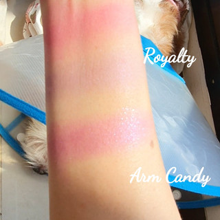
Swatches - Line/Eye
If you wish to see how the shades perform directly on my eye, please head to my vlog here. For line swatches, here are the stills done just this morning, when the beautiful sun hits my window; I thought these gorgeous shades deserve a "beautiful sun swatch" so you guys can see how brilliant they are or lack there of :


Right off the bat - all the shades have a very buttery smooth texture and hardly any fallouts or kick backs. All are very buildable and blends like a dream. Although some of the matt shades comes off chalky at first but do blend well (with not much effort). However their shimmers, satin and glitter shades are all super phenomenal in texture and application. Here is the low down :
The Matts - 8 shades
Vibes - a bright neon yellow that looks super pigmented on the pan but when swatched, it comes off more sheer and softer than punchy or intense. It is nice because if it were opaque and intense, it would not be a shade I would wear often unless I plan to do a retro 60's look with bell bottoms. I am glad they made this a soft sheer yellow which would be much more wearable on a day-to-day. But because I am a medium with neutral undertones, this shade can come off "mustardy" on me, ie, could be a trickier shade to do a pretty look if I am in a huge hurry to leave the house.
New Fling - a dark maroon with pink undertones, from the pan it looks super red maroon but upon swatching, I am picking up more pinky deep mauve coming through than maroon red. This is definitely a great shade to smoke out the outer V for sure. For sure not a shade I'd use for my upper eye lid as it is a tad "duller" hence not enough to help open up my lid space.
Mediterranean - a gorgeous dark teal, like a deep moss green. Another one similar to New Fling where this is nicer to use for my outer V than upper lid space. And I think for outer V, this shade is gonna be so smoking hot and sexy too. I love that this dark teal isnt looking greyish on me, it stays true to its shade on my skin tone. Nice surprise.
Shameless - a true hot neon pink that is super pretty and fun to use. This neon pink is bright enough to be used for my upper lid as it is quite soft and muted; not too opaque that makes me look dated or hard to go with what I plan to wear or even which lippey to match that day. Another nice one too. Though I already have quite a ton of pinks (please refer to my earlier blog titled Pink and Berries Compilation) so not an unusual one.
Royalty - a light cool-tone purple shade, not so pigmented and can come off like a cool sheer pink purple shade. So very pretty for my under eyelid but not for upper lid as it is not warm enough to open up my upper lid. It wont flatter my eye shape for sure. But for undereye? This can be quite pretty conveying a romantic moment.
Fiesty - a cool tone dark chocolate brown, nothing unusual with this one as I believe this shade was added to the palette to help "land the plane" and tone down or complete a colourful look. All palettes need a neutral shade for sure so this one is no exception. This baby and Secret Service (below) has very tiny silvery glitters if you look hard enough. Unlike the other mattes that are just matt pigment. This also has an obvious black undertone.
Coy - a super pretty pastel light blue, I am so obsessed with this one because a few of the pastel blues I own turned up greyish on me. Instead of brightening me up it made me look paler and ashy. The blue stays true to its colour when I used it - a true baby blue but not an overly opaque colour pay off, it is coming off a little sheer in texture. It is a pretty shade I would wear with a girly summery wraparound dress or a white t-shirt tucked into faded skinny jeans and large hoop earrings.
Secret Service - a black shade with super-fine silvery flecks, not just a normal black shade. This one with the silver sparkling flecks makes this such a sexy black that brings a totally different look to the table. It reminds me of a warm summer midnight sky with a million tiny sparkling stars. Also this matt swatches super nicely, unlike the other matte shades that comes off patchy and needs more blending work. This matte one has a nice consistent texture.
The Shimmers, Glitters & Satins - 12 shades
First Class - Stand Out Shade - a dark teal shimmery satin, the shade used for today's look. I love this shade so much that I cant get enough of it. It is so dang beautiful and it doesnt change upon application on my skin. So buttery-soft and smooth too. Together with the other stand out shade Riviera (see above) the whole "Teal" look is just pure #badass. I typically cant pull off a dark shade for my upper lid due to small eyelid space, but somehow this 2 shades became a game changer for me. I also wanna add that these 2 shimmer shades have a super finely-milled silvery gold glitters too. Some shimmers are just shimmers but these with glitters in it just took it to the next level. I also love how the glitters are so fine and elegant that only comes alive with the right lightings like a beautiful sunny day as per my visuals above.
Promiscious - if you took a double take on the name "Promiscious" and thought I made a typo on the spelling? Nope. It is exactly spelt that way and printed on my palette. See pix below.

So I believe this shade is called "Promiscuous" since there aint no such word as "Promiscious" and I wonder is this a deliberate typo or? If anyone can enlighten me would really appreciate. Anyhoo, as for the shade, this is a super pretty silvery-grey shade, upon application I could also spot some lavender blue super-fine glitters when the light hits at different angles. Seems all their shimmers have some form of finely-milled glitters in them; which is so girlie pretty I have to say except a prettier name would be the icing on this cake.
Paparazzi - a sheer golden-yellow shade that looks super pigmented from the pan, but upon application it comes off very sheer. Like a wash of sheer golden yellow. Pure satiny finish.
Sassy - a gorgeous bronze-orange-golden shade, super pigmented this one and intense. Not at all sheer if you expect a wash of colour. This baby is very intense, a bit moist to the touch and a pure satiny finish.
Old Money - a sexy smoky olive-kaki green shade that seems to have a black grey undertone. It is still a very nice shade to use to smoke out the outer V or for under eye shade. Which is a huge surprise factor to me as most shades I'd tried that has a black-dark blue-grey undertone would be a total train wreck on my skin tone. A pure satiny finish with light gold flecks. Very pigmented and intense.
Riviera - Stand Out Shade - this is a bright turquoise with a dark teal undertone. Super gorgeous and full of energy, I just wanna use this with every eye look. A pure satiny finish. Very pigmented and intense. This was the shade used to elevate today's look with First Class. Just check out my "sun swatches above" and see how brilliant this shade is.
Tease - a golden mauve-pink shade with a soft bronze undertone. Super pigmented and smooth texture. Similar to Sassy, a bit moist in texture. Pure shimmer finish. So pretty for neutral looks for upper lids that is office appropriate or could even be used for casual first dates.
Peacock - Stand Out Shade - a light soft turquoise with a light teal undertone, could also be described as a light minty-green shade. I'd be doing a second look using this shade. Cant wait. Same texture and finishing with First Class, shimmery with a rich smattering of tiny silvery glitters. PRETTY. See above "sun swatches". I love the glitters in all the shades are so soft focus like and not at all large like confetti which I could never pull it off well.
Arm Candy - purple with smoky pink undertones, very soft romantic vibes going on for this one, although not an uncommon shade I must say. A shimmer finish and moist texture. Would love to do a look with this soon as well.
Pin Up - this baby looks peachy from the pan but turns out to be a very pale silver with very very slight pinky undertones (no peachy shade at all), it has a very soft romantic vibe going on and so gorgeous on days you want a "no makeup makeup" look or even as a topper shade. Satin finish.
Silk Sheets - this guy is like a duo chrome to me, as it looks super white silver but upon swatching and application - I notice shifts of pale purple pink. Under bright sunlight as above pix show, the shade just disappears into my skin tone. I feel this could be used as a topper like Pin Up and also on days when you want a pretty glowing standalone sheen on your lid without obvious colours. Shimmer finish.
Glam Rock - Stand Out Shade - this is a super gorgeous straight up glitter formula. I believe SB meant this to be a topper shade to elevate whatever looks you decide to create that day. I am so obsessed with this one too as I could also use this on my lid for those "no-makeup-makeup" days. Beautiful as a standalone or as topper. Though I wanna add that I dont particularly like some glitter formulas that has big glitter flecks? I am envious of people who can pull it off, for me these formulas always add 10 years on me. But I am glad this pure glitter formula is so finely milled yet obvious, to me its the epitome of glitter "finesse" suiting my preference and to my advantage with thankfulness. For me - this formula is definitely a God-sent.
The Cost Vs Value
Alright, lets get down to the accounting part. LOL. 1st off the price is $84 not $85 sorry about my typo below.

So 84/20 shades = $4.20 per shade
4 20/1.25g per pan = $3.36 per gram
So 1g of pigment at SB is comparable to Charlotte Tilbury's Icon palette of 12 shades that includes a dark teal blue as well and way more affordable than Pat McGrath's single shade which is a whopping $24 for 1.1g!!. To give a clearer perspective - if you head to my previous blog on Makeup Geek - which is supposed to be a more affordably-priced makeup brand for the mainstream market set? Their rebranded shades of 1.5g each, now sets you back $5.49 to $7.99 per shade (1g is now $3.66 to $5.33). So if I were to compare SB with MUG as an example, SB is quite a valued purchase from a cost-value proposition at around $3.36 for 1g of pigment (very close to MUG). So while it may seem pricier for an upfront payment of $84 but with the above comparisons and juxtaposition, I feel this is a valued consideration since price point wise as shown above - it is slightly cheaper than MUG - although I love MUG too dont get me wrong; but I am talking about brand positioning and a certain aura of exclusiveness which SB offers more. If $84 is too high for you to fork out upfront, SB also offers #afterpay of 4 instalments so that should come in handy.
So here is my teal look I created for my #hoodedeyes and #texturedeyes using First Class, Riviera, Promiscious, Glam Rock and Silk Sheets (inner corners).
So to conclude, a valued "spend" consideration that I'd totally recommend, if you like me - A. dont already own most of the shades and B. have textured hooded eyes. Please let me know if you like this look and your thoughts on this palette too. Till my next blog using the Peacock shade...cheers guys. Stay home and stay safe. Hug your dog. V


Comments