


#sustainablemakeup Thematic Swatches Compilation - Pink and Berry | Homage To My Faves Part 1
- Madame Makeup Monologue #maturemakeup
- Mar 4, 2020
- 9 min read

Updated: Jul 24, 2020
"I'm gonna live like tomorrow doesn't exist Like it doesn't exist, I'm gonna fly like a bird through the night. Feel my tears as they dry..1,2,3,1,2,3, drink...I wanna swing from the chandelier, from the chand...de...li....eeerrrrrrrrr"..music from Sia plays on my #spotify while I get down to blog on my first thematic swatch. Hello everyone, if you are looking for a particular "Pink and Berry" shade and really dont feel like you wanna take time, effort and whatever energy's left in you; to video scroll from one #makeup Youtuber to the next to hunt "the one". Or you just dont wanna waste money purchasing a shade online and regret it because it is not the shade you are looking for; then keep reading. (P.s. you will also find this useful - a free download paper listing of each shade's side-by-side comparisons will be up by next week, just head to my main menu bar). Although primarily this was created in the hope that this reference list of all my similar shades will stop me from purchasing anymore similar colors going forward. #fingerscrossed #makeupgoals #omg #sustainablemakeup


I also wish to apologize that I took a while to post this baby up, for reasons I have already mentioned in my latest vlog hence I wont be reiterating it over here. On top of that, this is the first time I am doing a swatch compilation from 15 #omg eye palettes, I want it to be as perfect for you guys as I possibly can. Hence it took longer than I'd expected.
One caveat to highlight - all my reviews on these 15 palettes are mainly first impressions except for the Kylie "Your So Money" palette which I have played with half of the shades on my eyes (a number of times) before during my personal trials and they all performed freaking awesomely for my textured eyelids and hooded eyes (no texture, no fallouts and great color payoffs). Of course I still needed to do an important technique for my textured eyes that I cant skip during eyeshadow applications. So just to highlight that I will definitely update as I go whether the rest of the palettes will perform as great for my textured eyelids. Ie causes the skin texture on my upper eyelids to become much more pronounced (#hellno). So do watch out for it!
So without further ado - lets get started - The breakdown of the star players :
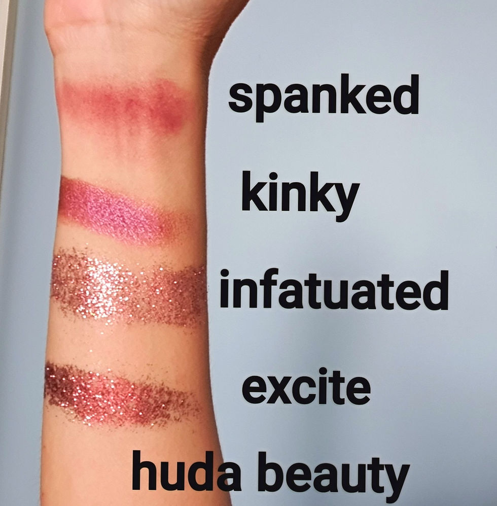
Star Palette 1 Huda Beauty - New Nude
Mattes - Spanked
Shimmers - Kinky
Glitters - Infatuated and Excite
First impression review (FIR) - Overall for these 4 shades, I was super satisfied with the matte and shimmer shades - Spanked and Kinky. In that there was a great color payoff (super pigmented) and zero fall outs. I also super adore both Spanked and Kinky due to it's super warm color tone that really perks up my skin tone immediately. Though both I'd use more for my outer "V" or lower eye lid not for the upper lids as I feel it is not bright enough to enlarge my small eye space having an #hoodeneyes situation. For the 2 glitter shades, naturally there were fallouts and quite large chunks too, so if you are using these; you really need to wet your brush or fingers prior to applications. But crazy obsessing over these 2 glitters for my upper lids. Cant wait to see how it will perform.
This super gorgeous shimmer has my heart for the longest time. It brings a beautifully soft ballet slipper pink shade to the table with small elegant pearly glitters. No fall outs. It is pigmented with the slightest amount used. I love using this shade on my inner corners when I dont want to have an overly obvious inner corner. It could definitely take me from work to early drinks with sassy appeal and elegance.
Star Palette 3 Pat McGrath Labs - Subversive
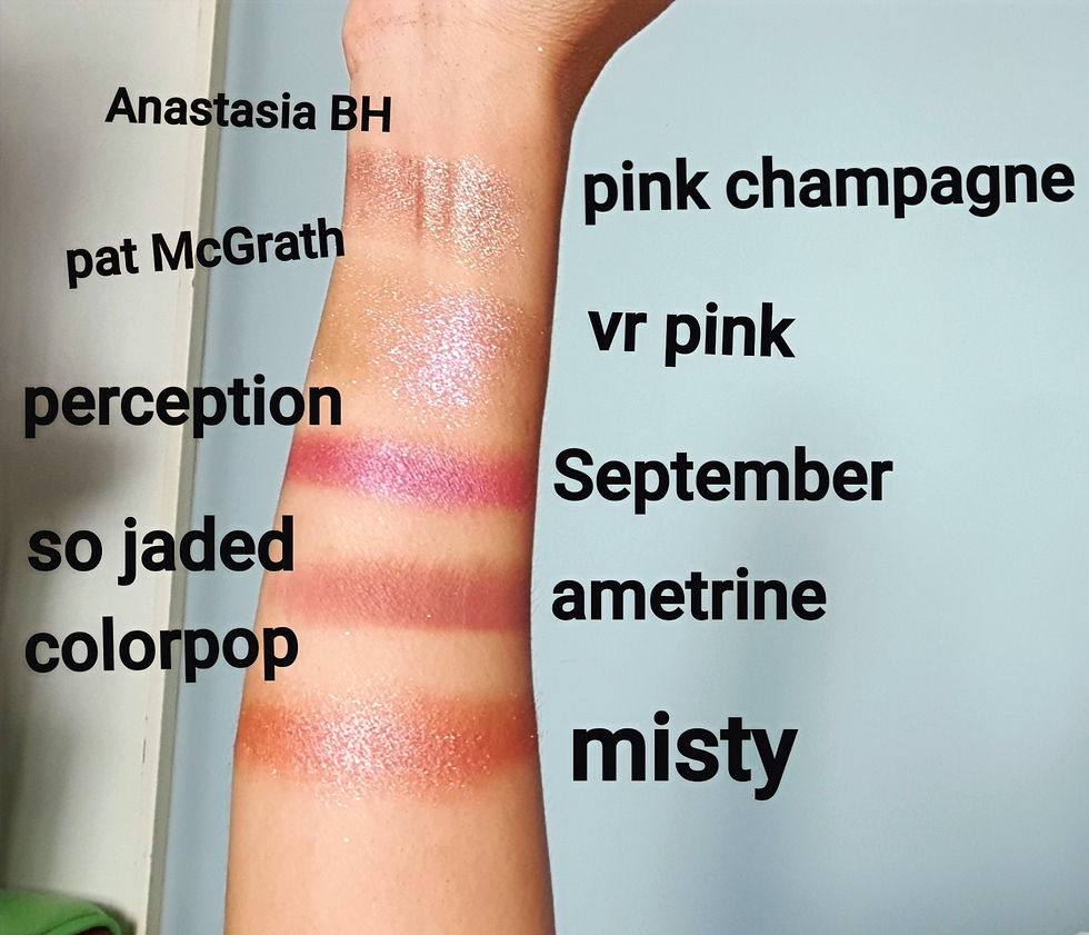
The only pink tone in Subversive is VR Pink, which by the way was one of the shade calling out my name when I spotted it onsite. I think this was my very first experience with this iconic brand, because if you are already a big fan of the brand; you would already know that most of their shades are not straight-forward nor true in color unless its meant to be. Its to me like a double-edged sword if you will - because on one hand - its unique and very signature of PM, but on the other hand you never know what you are really getting unless you check reviews or go in physical store for swatches (even then you may not get to swatch any if they are not launched in physical stores yet). Most of their shades are always super innovative with matte, pearl and sparkle finishes through to holographic iridescence and offers multiple metallic shifts underneath. So that was why I was mildly disappointed when I got the palette and swatched it, because it was not the pretty dusty-rose pink featured in their photo onsite. Their #mothership palettes are not crazy affordable too with a $175 price tag, hence you better make triple sure the shades are what you can use; if you dont wanna see your $175 fly away into the skies which I am sure could be super painful in the heart zone for some of us.
Just take a look at the screen grab onsite below - doesnt' the pink shade looks like a super icy-dusty rose type of pink but if you compare it to my line swatch above, the shade turns out to only have a glimpse of soft pink underneath, like in the deep deep deep layers LOL. From the upfront colors are like more of a mixtape of light purple to pale gold-silver shifts. You only get a "taste" of a remote pink color upon closer encounter like when someone is gonna kiss you or you accidentally trip and someone's face fell on yours, get it? Further, the formula is not like ABH's, where it performs magnificently either on eyelid or inner corners. This VR Pink cant be used for my inner corners as it is quite a moist-drippy texture that only shows-off its true colors with a wide space application (like on upper eye lids). On a tiny space or dot application, the color pay-off will not emerge at all, hence you will only see a wet glob of transparent silvery shade on your inner corners. I believe PM made this to be a topper shade to enhance or magnify the colour you'd already applied on your lid. Then OMG this shade really shines and performs like a #rockstar. But as a standalone shade, especially for inner corners, not a good look unless you are trying to achieve an "I just woke up with crusty eye" look. That said, I still love this palette due to all the super unique individual shades as mentioned earlier for achieving unique and glamorous eye looks.

Star Palette 4 #ColorpopxShayla - Perception
Similarly in this pretty boy, there is only one pink shade - it is called September. This is not a true matte, it has a slight shimmer finish. It also has a very deep mauve-y undertone hence not a true pink. Texture wise on first-impression finger swatch is good, very buttery soft, no kick backs and no fall outs. Will see though how it will perform when I actually use it on my eyes. Stay tuned.
Star Palette 5 #ColorpopxKathleenLights - So Jaded
OMG this palette, where do I even start? First, I love every single freaking shadow color in this palette which I will save my comments for when I do a single palette test and review. But suffice to say, for now, from my finger swatch and some initial brush applications of a couple of shades for my inner corners; the texture experience has been good thus far. For the purpose of this blog, the only shade closest to today's theme is Ametrine - This shade turned out to be one of my top faves and #mygem. Reason being : A) The color payoff is exactly what you see from the pan, a beautiful dusty-rose pink with a soft mauve-y to purple undertone (though off cam it is picking up a lot more beige brown undertones). It is so beautifully muted and soft but not docile if you will; in anyway imaginable. A little like me haha. It is a soft dusty rose pink that is unapologetic and bold. You can say it does pack a very gorgeous punch. B) What I also love about this shade formula is that it is so blendable (I realized blendability has a range - some more than others) with other shades, that everything is so seamless and smokey not ashy nor patchy, with just very minimal effort from me. A very good shade for beginner's level like yours truly for now. If all the other shades from this palette performs like Ametrine, OMG, then this palette is a really good buy for the price of $39.00 for 30 shades at approximately $1.30 each. Although I must say it is only 0.09g per pan x less than 2.5cm diameter size (see CPXKL palette on the left side below), vs the ideal diameter pan size I prefer is 3cm and above (see Makeup Addiction on the right below) which typically offers around 1.5g per shade pan. What this means is, if I really love using this Ametrine, I cant use it so often unless I am able to get an identical dupe from other brands or Colorpop offers a single shade of Ametrine for purchase that I can replace with if this runs out. As I also do not own any shade in my repertoire that comes close to Ametrine's color, payoff and gold-dust finishing (the beautiful gold sparkles nicely surfacing only upon application on the eye as it isnt obvious from the pan) - that only a discerning eye will be able to spot.

Star Palette 6 Colorpop - Single Shadows
There are 2 mattes, 2 metallics and 2 duo chromes.

Misty and Solstice With The Mostest - Metallics
Misty - described onsite as a super pigmented metallic pinky rose with baby blue glitters, is easily blendable and also offers a velvety soft texture. Did I get all that? Yes, yes and yes! However, as far blendability goes, I still need to test it out further on the eyes with other shades to really see how it performs. Love the butteriness of the swatches.
Solstice With The Mostest - now this one I have an issue - although I love the color which is a metallic neon pink with a blue sheen and true to its description too, but I had to clean off the shadow from my eye (see my vlog for my sum-up commentary) 5 times before it totally came off. Dont know why that is. The rest came off on the first cleanse. Also this shade is not recommended onsite to be used in immediate eye area. So you guys need to remember to check the respective footnote description of the shades desired before adding to cart. However as far as texture is concern, I did enjoy the same quality as Misty.
Thank U Next and Come and Get It - Duo Chromes
Thank U Next - described as a metallic rosy bronze with a copper duo chrome flip. It was exactly that. No complaints and all good stuff. I love this shade for how super warm it is that immediately brightens me up should I feel sickly that day, this is one shade I will use to jolt my pale skin out of oblivion for sure.
Come and Get it - This duo chrome is described onsite as a duo chrome rose with a gold flip. Yes I got that in person and I am obsessed about this shade as well due to how super peachy rosey it looks on my skin. I feel like this is more a satin shimmer than a duo chrome with a flip because it felt so soft and buttery and muted, the duo chrome vibe is fairly hidden here too I feel. But still so gorgeous and pretty. Both very pigmented.
Sandbar and For Shore - Final 2 Mattes for Part 1
Sandbar - described onsite as a matte neon pink, but I dont like this one, reason being it is not at all neon. It is very dull on my skin instead of perking up my skin tone, I feel like this shade made me look boring and dull. Maybe it's the matte formula. So this one is a no for me. Texture and payoffs are all awesome as the rest.
For Shore - described onsite as a matte neon warm pink. Same review as Sandbar, I dont like this shade too. It is neither sunny bright nor romantic, it lies somewhere in between like an indecision would. I am totally uninspired by this shade upon swatch applications. I doubt I will be using these 2 shades for further trials. Dont get me wrong, both shades are very pigmented and texture quality are awesome as well, but some how the color just does not work on my medium with neutral undertone skin tone.
Okay guys, thats it for my first part 1, let me do a #sunsalutation with some very deep breathing to #exhale and relax before getting back to finishing my Part 2 in my next blog for the rest of the 9 palettes. Its hard work you guys. Thank you for reading my blog and I hope you managed to find the pink or berry shade that speaks to you so far, at least from this first elaborate but fun exercise. Please give me time to put the "side-by-side comps" PDF download for you guys, I aim to post that up by next week #fingerscrossed. V


Comments